The EQIL Project
Branding and Visual Identity
Logo Design
Web Design
Cover Design
Social Media Assets
Visual Identity
Brand Positioning & Guidelines
The EQIL (Empowering Queer Immigrant Lives) Project puts forth media projects to reflect real conversations and aims to cultivate spaces for QTBIPOC folks. As a Design and Comms Lead, I have designed the logo as well as curated a visual identity to be utilized across social media, physical promotional materials, website and more.
The EQIL Project is an initiative that aims to shine a light on QTBIPOC Immigrant Narratives and is based in New York City. The acronym stands for “Empowering Queer Immigrant Lives.”

To create a fun yet personable logo to represent all that the EQIl Project already is and aims to be, this type based icon is blocky yet bubbly. EQIL would not have begun without the push for a space to be held for experiences that are often dismissed alongside intersectionality. This initiative began after my co-researcher and I noticed a gap within our community which in turn has turned into media projects that hold close to a “for us and by us” standard of accountability that our peers mentioned was needed for a physical and digital space. With a capitalized “Q” for our pride in Queerness and a nod to the very real immigrants behind EQIL with the “i”, this logo captures the very essence of the project.
The EQIL Project: Logo in Various Colorways.
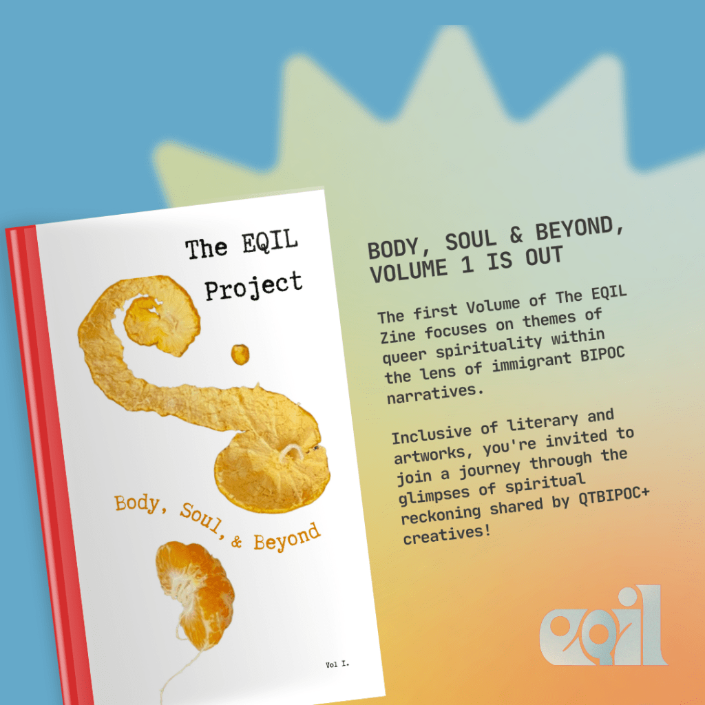
The EQIL Pride 2024 Zine. Explore Vol. 1 digitally here.
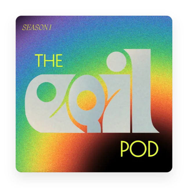
The EQIL Podcast Cover. Check it out Spotify and Apple Podcasts.
Branding extends beyond the logo and the media projects as well. Below are examples of how EQIL is presented digitally.
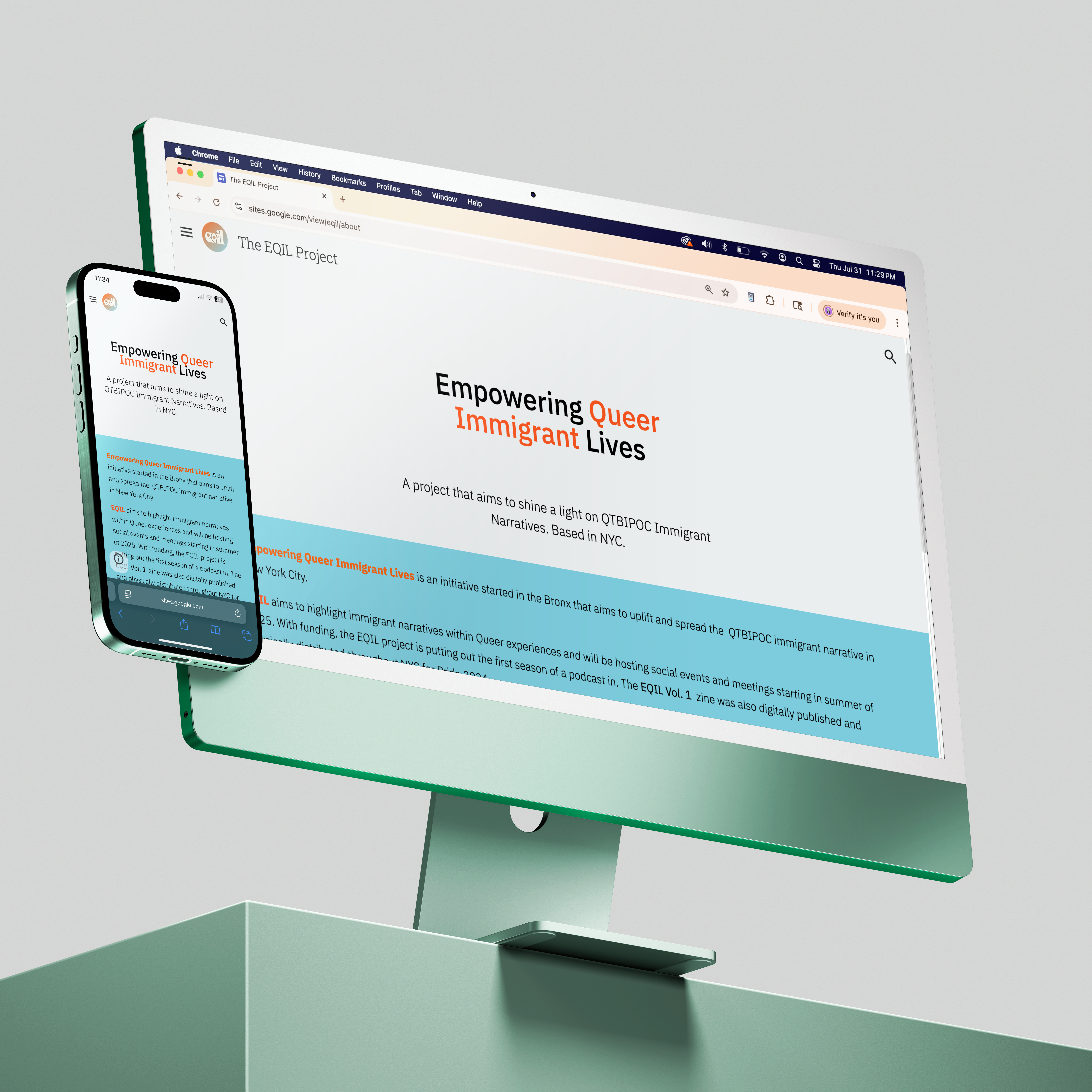
The website is currently undergoing a re-design amidst transferring the hosting platform but above are examples of the former design.
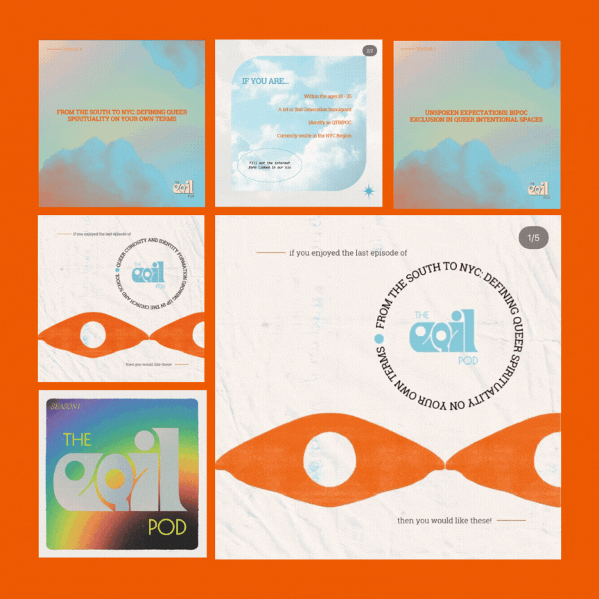
Social media assets are also intentionally designed and a significant part of the EQIL visual identity. Feel free to check out the Instagram!
